Graph-explorer
A graphite dashboard that's different, from Vimeo

Structures your metrics
The Graphite tree model is hard to organize and query, it lacks information and can be inflexible when building graphs.
GE uses a multi-dimensional metric database so that your metrics like
servers.dfvimeodfs1.diskspace._srv_node_dfs10.byte_used{
server=dfvimeodfs1
plugin=diskspace
mountpoint=_srv_node_dfs10
unit=B
type=used
target_type=gauge
}Compose graphs on the fly
Using simple GEQL queries you retrieve metrics, process and organize them into graphs. Graphs are never predefined because there's no need to hardcode metric names or graphite function calls.
Units
Every metric gets a standardized unit tag, so:- you always know exactly what you're looking at
- Graph-Explorer converts units for you and derives as needed. E.g. it can render a metric in B(ytes) as an amount of TB, bytes per day, Gibibits per hour, ...
- Because every metric self-describes its type it knows that for example counters are most useful when derived by default

Online aggregation
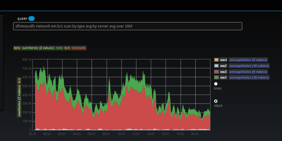
Choose one or more tag keys to combine targets by, and represent them as one metric. For example: show network traffic per interface, averaged across all servers and summed by type (rx and tx). Also shown here is averaging over any arbitrary timespan.Group metrics into graphs
Group by arbitrary tag keys. For example: "group by server" show bytes used for all mountpoints on per-server graphs whereas "group by mountpoint" creates graphs per mountpoint, each showing the bytes used on each server by that mountpoint.Correlate with events
Integrates with anthracite for displaying annotated events. More specifically, you can show events from ElasticSearch, and you can filter them with powerfull Lucene queries, which is great to look for specific deploys/fixes of specific tickets etc. Trivial example below.
Interactive graphs
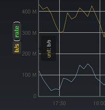
realtime zooming, inspect datapoints, switch display mode, etc.More
Introduction to metrics 2.0 & Graph-Explorer
view on Vimeo
On the roadmap
- Comments on graphs/dashboards. Want to integrate with something like talkatv for that
- Better displaying of annotated events. Leverage anthracite event search/filtering
- Allow to modify queries of a dashboard directly. In other words: allow to split up the query page into multiple queries with each their result


